Two solutions, toward a schematic high frequency map.

Here go the fruits of my latest and longest work in years: two maps, one depicting the main surface transit system “Mapa Xarxa Principal”of Barcelona and the other the high frequency surface system“Xarxa Freqüència Alta”of the same city.
Both maps show only TMB (Transports Metropolitans de Barcelona) routes, which serve the main core of the agglomeration: ca. 2,800,000 inhabitants in 11 localities, surrounding the main city of 1,650,000 alone.
This work started out of frustration with the current official map* of the surface transit, which is visually cramped and flawed when it comes to information design: all routes (more than 100) are in a single weight, red line, not showing the very different headway, from every 5’ to 5 trips/day, nor the different type of services (ortogonal, standard, bus del barri, express); on top of that, the routes identification are presented in a strange and heavy form (an arrow formed by two symmetric slanted parallelograms, big enough for the number to be inserted, indicating the sense of circulation as well), placed along the lines, with more than a thousand stops punctuating the maze of lines, all participating to crowd the geographic (anamorphic) basemap.
I come with two different maps, with two different backgrounds, two different constructions, but a similar approach regarding visual syntax; the first could be seen as an introduction to the second, the two might be seen as complementary.
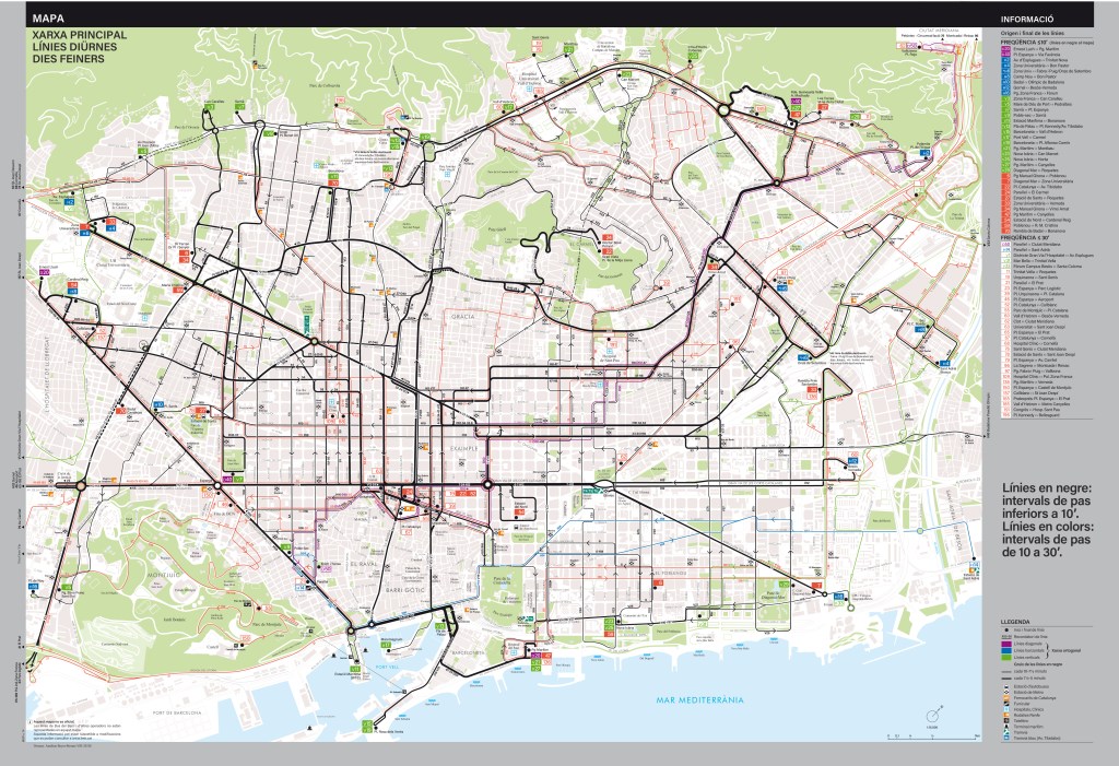
1. “Main System Map”, Mapa Xarxa Principal
I simplified the representation using only two variables, line-weight and color, for the 66 routes depicted (only regulars routes, with less than 30’ headway, Monday through Friday), as follows:
- black is used to highlight routes with hedaway lower than 10 minutes, regardless of their official colors (which are visible at termini, in the route identification), within the 34 routes that are in this category; two different line-weight detail furthermore the frequency
- medium lines for 7,5’ to 10’ headway;
- broader lines for 5’ to 7,5’ headway;
- official colors of the “orthogonal network” (Xarxa ortogonal) for routes with frequency higher than 10’:
- violet for “diagonal” routes,
- deep blue for “horizontal” routes,
- green for “vertical” routes,
- and red for the other routes that are not part of the “orthogonal network”.
Those colors are always visible in the termini route signs, marked geographically by a plain black disc near the route identification (rectangle in the color of the route, with the number in solid white, flushed on the right).
I also simplify the base map which I drew too, not using any anamorphosis anymore (now useless since the large central part is lightened by the choices of representation), it is tuned down in a light warm grey hue. Only the most important generators remain labeled in a serif typeface, unlike all information related to transit using different fonts of the same linear typeface (lower case Acumin) and another typeface of the same group for labels related to the geography of the city (upper case Futura).
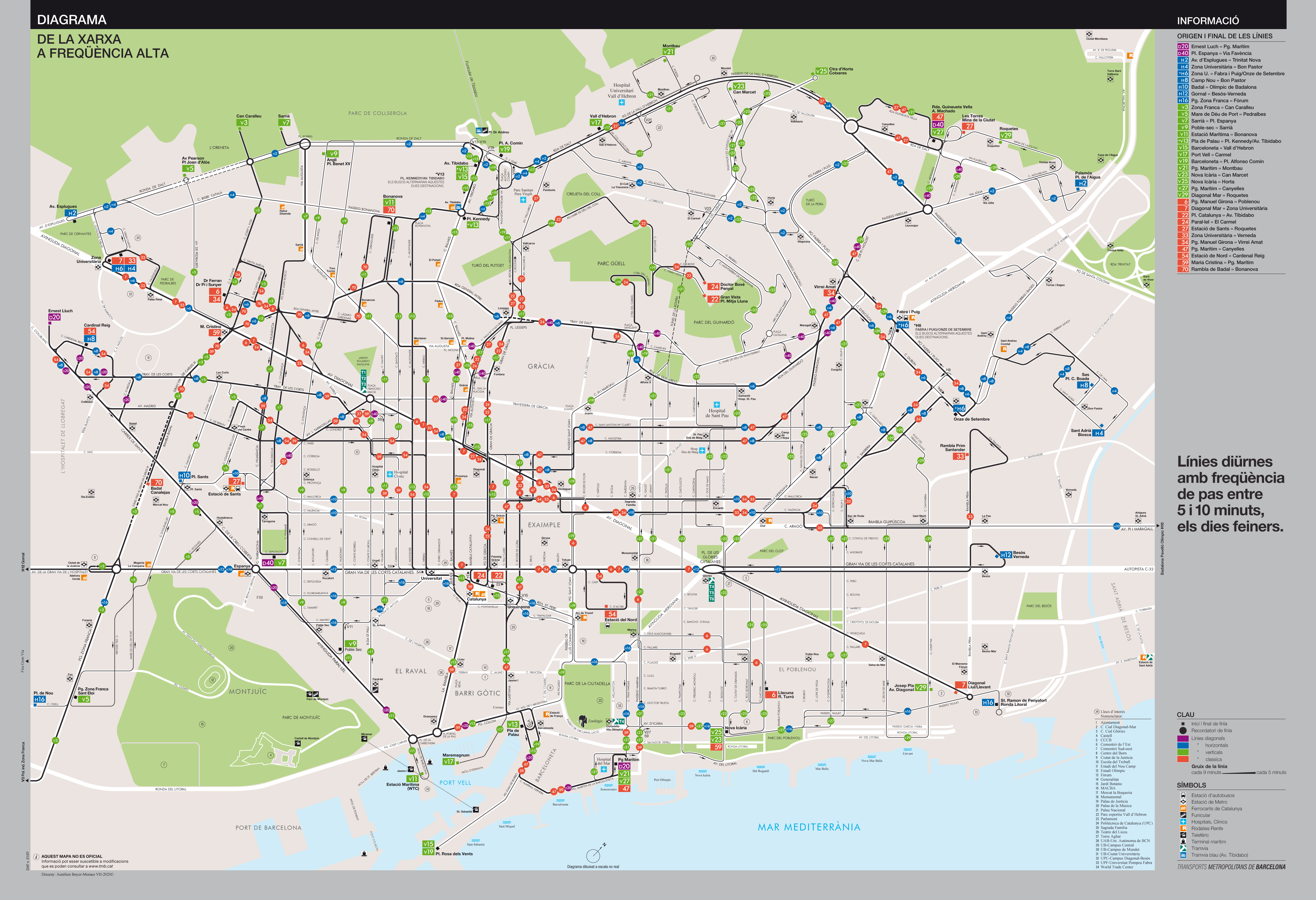
2. “High Frequency Network Map”, Diagrama Xarxa Freqüència Alta
I draw an entirely different map, centered on the depiction of the system in its urban context, in a “geo-schematic” approach, using rather the main features of the urban context to structure the whole drawing of the network of the 34 most frequent routes (of those, 23 are from the “orthogonal network”).
All routes of the network are represented in black lines since they all have minimal headway of 10 minutes, but here these lines are finer because there is no need to highlight them against other routes like in the former map, and they are on the solid white used for the streets (avenues, boulevards, thoroughfares) on the back, which puts even more emphasis on them.
The routes reminders allow to identify the individual routes easily. They are round bullets in the routes colors, as mentioned above (red, violet, deep blue, green).
The termini (end/start) of routes are highlighted by a square (in contrast to the reminders round bullets) in the same color as the identification sign placed nearby, formed by a rectangle displaying in solid white the number (flushed on the right) on the route color.
The geographic labels (district, street name, etc.) are all in upper case Futura, while all the labels related to the network and its services are in another lineal typeface, Acumin, lower case.
I keep the main generators, which are indexed by numbers (and named in a roman, lower case, serif typeface) in order to maximize the space available for the network itself. I wanted the diagram to be as aerated as possible.

Both maps are oriented to the northwest, as it is usual to represent Barcelona, with the Mediterranean appearing at the bottom, hence these references to “horizontal”, “vertical” and “diagonal” epithets, which would be senseless in another representation of the same city and network.
The metro and other means of transportation are not forgotten, they are presented on the two maps by a collection of pictograms, but those maps are clearly surface oriented.
Now that the “orthogonal network” is fully implemented, the whole surface system shows us more than ever the specific urban layout of Barcelona, mostly the result of the famous project of the Infrastructure engineer Ildefons Cerdà.
The promoters of the “orthogonal network” wanted to take advantage of this unique structure occupying a large and very dense central area (ca. 600,000 inhabitants on 20 km²)† of the agglomeration, eliminating redundant routing, simplifying routes, hence facilitating the connections and the users’ journeys.
The first drafts of the “orthogonal network” were more ambitious and were meant to replace almost all the surface routes with routes following those unique directions; this project was tuned down in front of the complexity of the implementation of such a system. So a reduced version of the network was introduced progressively between October 2012 and November 2018.
Notes
* Regarding the official TMB Bus maps: I could write an entire article about the different representations that have succeeded since the 1970s. I have copies of all the maps (from every different representation system) until today, and I have to say that the representation used in the 1990s was peculiar and graphically compelling, but also rather intricate in use, not that practical. It was more of a graphic oddity, in the good sense, since the graphics were of very high standard (work of Morillas i associats), but the semiology was slightly too complicated. Still, I appreciated it, it was, and remains atypical, it even played a role in my choice to go towards that field of graphic design (I was 18 when I discovered the map during a stay in this city, my first, I was at the time attending the 1st year at Fine Arts School). Anyway, this map was replaced in the early 2000s by a much more traditional geographic one, with tons of color nuances and individual representation of more than 100 routes, with countless sections followed by 5/6 routes. It was almost visually aggressive (all these individual lines in so many colors, all the forms being outlined in black). Then, in the 2010s, TMB came up with the current version, which is somewhat lighter but still unsatisfactory because of the flaws of its conception: no hierarchy, no treatment whatsoever of the information presented.
† Area and population are referring to the whole area from Pr. Espanya (SE) to Riu Besós (NW) and from the coast to the travessera de Graciá (as a reference line).
PS: right-click on the image to open it in a new tab and see it full size.
